

Secondary Research
Competitive analysis

Primary Research
Ten interviews

Key insights
- People don't want to be used or seen as a promotional vehicle (e.g. "Tweeting for deals").
- People like receiving recommendations more than giving them.
- Lists are seen as useful but tedious to keep.
- Customers are wary of places offering deals.
- Most people dislike searching for deals.
Online survey of 150 people


Key insights
- People are indecisive. And despite the ease and popularity of recommendation engines, they place the most trust in friends. Beyond that they like to go with their senses.
- One of Everfave's first major features was "Moments," the ability to socialize with friends about favorite physical locations. At your favorite Thai place? Snap a pic, and your friends can see the picture next time they visit that Thai place. What are data shows, however, is that this sort of location-based social media is rarely sought after.
- People share media around the focal point of friends/family, not locations.
Usability tests with existing wireframes

Key insights
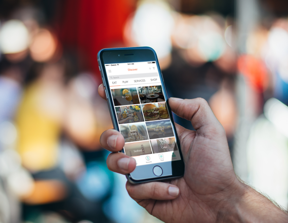
- Iconography confused people. Faves, bucket list, and filters icons not well-distinguished.
- Main navigation not intuitive.
- No way to choose preferences. Places shown as an endless, random stream.
Fundamental Problems
- While review sites provide a large quantity of feedback, the reviewers' demographics and specific tastes are unknown. The person looking up reviews doesn’t know if the people who left reviews have different priorities, personalities, or preferences.
- The question for us becomes: how do we bridge the gap between friends databases?
- Each person has a database of great places in their heads. Each person has friends with their own sets of unique databases.
- People trust friends' judgements, but recommendation exchange takes too much effort from both sides.
- Because of this disconnect, people place their trust in review sites like Yelp or Foursquare.

Design
Personas


Iterative process

Ideation
Included multiple rounds of sketching and discussing with the team. Ideas were proposed, argued over, and mapped out onto a big board of use-cases as we gradually honed in on a few major themes.
When it came to wireframes, work was divvied up amongst the group, with each member building an area of the app within Sketch.

Usability testing
Multiple rounds of guerilla testing.
User hang-ups led to a major reorganization of our app's swiping feature. What began as a "Tinder for places" ended up as a secondary way of viewing a place's page.


